
In today’s How to Use Colours on Your Website to Get More Clicks post, I’m going to share why colour is crucial if you want to appeal to the right type of visitors and make your website stand out from the crowd.
Obviously, you want to attract prospects who are going to convert into paying customers.
When most visitors land on your website they decide in seconds about whether they trust you and want to stick around for more. This often happens before they’ve read a word of your content.
That’s why the colour scheme you use on your website is extremely important.
Use it correctly and you will:
- Have instant appeal to your ideal prospect.
- Stand out as unique, with your own personality.
- Communicate a style, brand and approach.
- Make your website easy and stress-free to navigate at a glance.
- Showcase your content in the best possible way.
- Give visitors the confidence to share your content with others.
Use it badly and you will:
- Repel visitors before they get to know what you’re about.
- Irritate their eyes with clashing colours.
- Make them doubt your professionalism.
- Send out the wrong messages about you, your brand and your products.
- Overwhelm the content and make it hard to read.
- Confuse the eye so they find it hard to navigate.
- Be too unattractive to share with others on their social networks.
So, what colours should you choose for your design?
Many online marketing articles give you “facts” about the “right” colours. They tell you that certain colours should be used for certain websites. For example, green for health or blue for financial advice.
However, it’s not that simple. Colour isn’t an absolute science with hard rules and guaranteed results.
What’s more, if you DO follow the commonly spouted web design advice, you’ll end up with a website that looks exactly like your competitor’s one. Using the expected colours can make you come across as boring, clichéd, lazy, and lacking in personality.
Yes, certain colours do have psychological traits. Purple can indicate sophistication, green can indicate calmness and nature, red can indicate alarm, passion, or excitement, yellow can be meditative, and so on. However, simply slapping yellow onto your well-being website, green onto your nutrition website, or red onto your dating tips website won’t necessarily make people like and trust you.
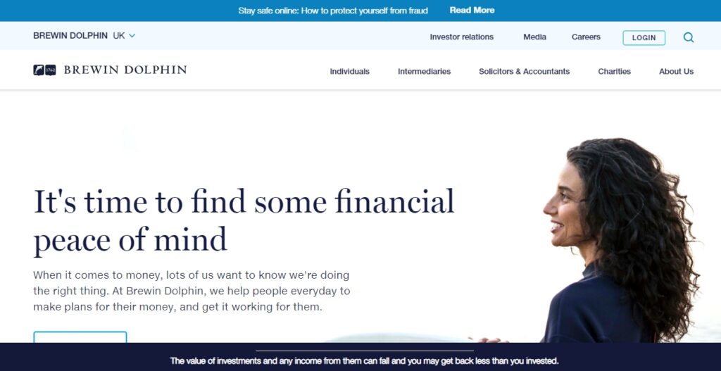
Here’s an example of someone doing the “right” thing. It’s a financial website so they’ve gone for that traditional blue colour almost all similar sites use:
But here’s another one in green that stands out from the crowd:
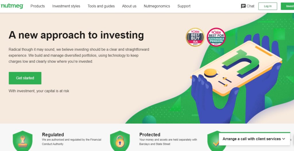
This looks far fresher, more contemporary, with bags more personality. And it will most likely make a visitor stop and look harder.
Standing out is important in an increasingly cluttered Internet, with everyone following the same old stock advice. This is key if you want to get email sign-ups for instance.
The Isolation Effect
Many people argue over which colour a “Buy Now” or “Join Now” button works best. However, it’s not just about the colour, it’s about how it looks against the colours on the rest of your site. It’s called the “isolation effect“.
Take a look at these:

The one on the left looks nicer, with the greens co-ordinating, but when it came to clicking “Get Started Now!“, red out-performed green by 21%.
Remember it’s not about the colour, but about how the colour works with or against the rest of the stuff on your website.
Use colour to guide the eye to the content you want visitors to see.
When it comes down to it, colour should be used as a way of making your content seen and nothing more. Here’s an example of using the “isolation effect” in a beauty website to guide the visitor’s eye:
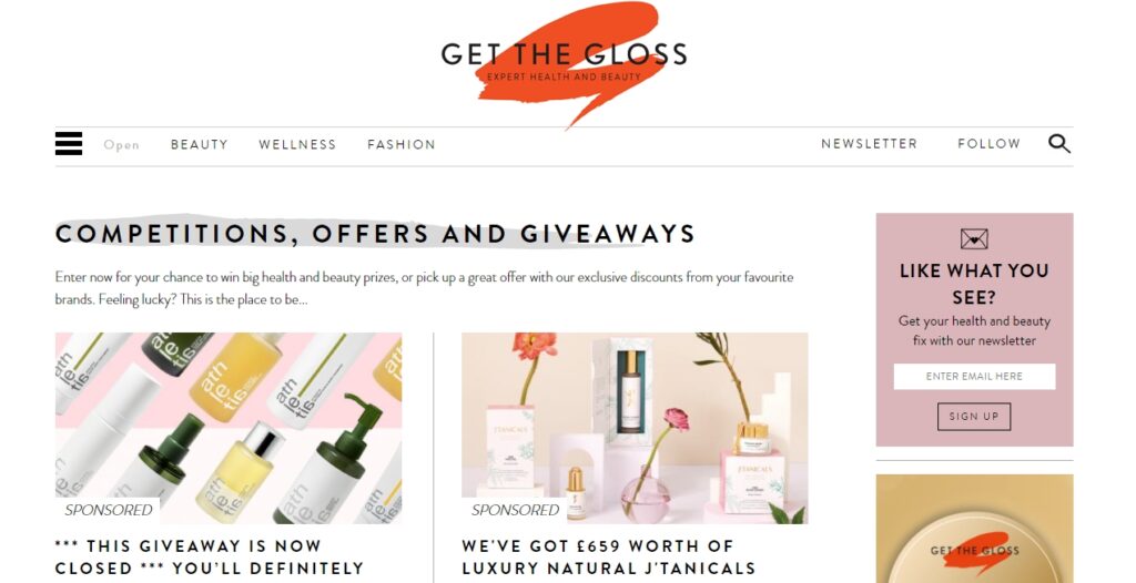
As you can see, a splash of stand-out red highlights the brand name. You’ll also see a splash of grey highlighting competition, offers and giveaways. In addition, the highlighted purple draws your attention to the sign-up form for their newsletter.
Or in this eco-website, bright red is used to highlight the top banner announcing their sale. Then green is used to highlight the “Add to Cart” button and the “Subscribe” button to sign up for their newsletter – three of the most important things on the page!

This pet-sitting website uses a second highlight colour – green – to isolate their “Finding a pet sitter“, “Search for homes to sit” and “Help” button. This helps retain viewers coming across their site for the first time.

Nothing about this is very subtle or sophisticated. You don’t need a design degree or knowledge of different shades and colour. Anyone can use very basic, seemingly “ugly” colours to get their content read.
Sometimes it’s even best to use NO colour at all.
Black and White Rules OK!
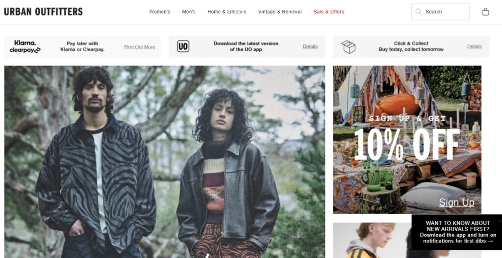
If you have a strongly visual business, with plenty of good photography showing off your products, then simple black and white can be the best way to let your customers see the goods.
Look at this, from the hugely successful retailer Urban Outfitters:
Or this from Mitas & Co.
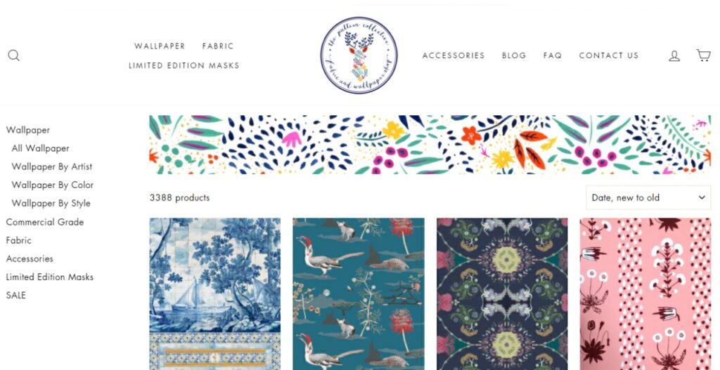
At first glance you’d think that this website uses colours, but that effect comes from the images, not the website itself.
In these cases, it’s the images you choose to go with your pages, or the images you take of your products, that are important.
Adding colours, however “right” may only distract from the copy, the products, and the navigation.
Here’s an example of where colour overwhelms:
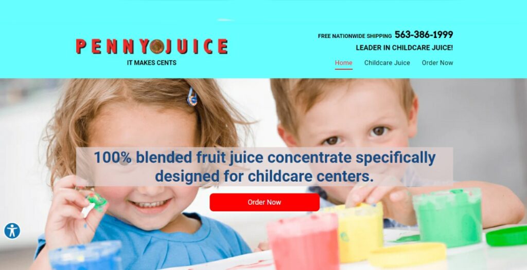
Although this site has a user-friendly interface, they didn’t quite nail the colour scheme!
And in this example of a car review site, the advertising is so important (where they’ll be getting their income), they’ve left almost all the colour to the ads, except for an “isolation effect” splash of yellow to highlight the website name AND the red stars:

Again, the issue isn’t that they’ve used yellow and red as their colours – they could have used green or purple, for instance. It’s about how it fits against the images and layout of the website, and what it is the colour is supposed to achieve.
Recommendations for Beginners:
If you’re not sure what to go with, use hardly any colour on your site at all.
- Use black or grey on a white background with one contrast colour (use sparingly) and one opposing colour to use as an isolator or highlighter to draw your visitors to specific areas of your site.
- Instead of splashing colour everywhere use it practically.
- Use it on navigation or menu buttons and to highlight important parts of your website.
Just because you have a “brand” colour or logo, doesn’t mean you need to put it all over your website. Less is sometimes more.
Great photography is key. Always use high quality images. If your pictures are looking dull or lifeless, try making them black and white to add a sense of style.
If your website is a shop, let the products do the talking. Choose a white background and have your products photographed professionally. If you have suppliers, ask for press photos of the products. Your product photos will be the colour on your website, so the rest can be pared back – black and white, or grey and white.

I hope you found my How to Use Colours on Your Website to Help You Get More Clicks post helpful. Don’t always listen to the colour rules – listen to your visitors and your customers. They are the ones who are making the important decisions when they land on your website – to buy or not to buy!
You can always test out different colours and see what colours generate the best results for you.
To Your Success!


2 replies to "How to Use Colours on Your Website to Get More Clicks"
Fascinating article, many thanks for sharing the helpful insights.
Hi Kieren, thanks so much for taking time to read my post. So pleased you found it useful. Some simple tweaks on a website can make all the difference to its visibility and user experience.